
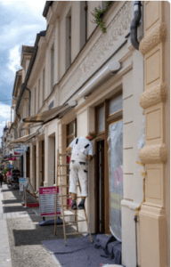
 When it’s time to paint your retail store, there are a few important things to remember. When choosing a colour scheme, you should keep your customer base and the environment you want to foster in mind.
The colours you choose make an impression on your customers the moment they walk in the door. If you’re ready to boost your sales and have customers coming back for more, check out our tips for commercial painting!
Know your customer base
Think about who frequents your business. Are you an upscale clothing store or a bustling home improvement store? While this is an extreme comparison, both places have their own target markets and would paint their establishments differently. Ask yourself the following questions before choosing your paint colours:
- What do I sell?
- Who buys my products?
By asking yourself these simple questions, you can choose the right colour scheme for your business.
Your products matter the most when it comes to creating a comfortable space. Think about your brand and what you want it to say. Do you have a logo or colour scheme people associate with it? Use this to your advantage by incorporating these colours into your palette.
Also, think about your target market. Are you selling children’s toys or women’s clothing? Bold primary colours like blue or red work better if your target market is kids. In contrast, lighter colours like yellow or orange make more sense for a predominantly female customer base.
Consider your space
Keep the amount of space you have in mind when painting a building’s interior. Do you have a large open space or an office suite in a busy building? Making a small space feel tinier is far from ideal.
Paint colours make or break a space, which is why you should use lighter neutrals in small spaces. Light grays and whites will make a room feel bigger.
In contrast, dark shades will make your space feel smaller than it is. Feeling claustrophobic is something you want to avoid. Your customers should feel calm and comfortable when they visit your store!
The effects of colour psychology
Think about colour psychology when painting a commercial space — people associate colours with different moods and actions.
Tones affect how a customer feels when they enter your establishment. Understanding the contrast between warm and cool colours is valuable when selecting a colour palette for a retail store.
Warm colours such as yellow, orange and red are bold and exciting! Additionally, they make visitors feel happy and positive. By choosing warm colours, you let your customers feel welcomed and glad to be in your store. An upbeat business like a department store or gym may benefit from a warm paint job.
In contrast, cool colours like green, blue and purple promote a sense of calm and relaxation. Stay on the cooler side if you run a business that promotes these aspects. These colours are ideal for businesses in the health and wellness industry such as spas and yoga studios.