
When it’s time to dine, customers take in the smell of delicious cuisines and enjoy the atmosphere. Did you know the colours you paint your restaurant can affect a guest’s overall experience?
 Putting thought and care into how you paint your restaurant is essential to your success. You should think about various aspects when you’re painting a restaurant, but the customers should be the top priority.
Follow these tips to ensure your customers keep ordering and coming back again and again.
Type of establishment
What kind of restaurant do you own? An essential part of commercial painting is catering the colour palette to the business. These are some common restaurant types:
- Casual sit-down
- Take-out
- Formal dining
Let’s talk about the differences between these examples and how they affect your paint colours.
A smaller sit-down restaurant may cater to families or those looking for an affordable option. At these establishments, customers are looking for a relaxing time with friends or loved ones. For example, a green paint job is generally associated with nature, which is calming and promotes a positive atmosphere.
At a take-out restaurant, people like to get their food and go or stay for short periods of time. If you primarily serve food to go or have minimal seating, go with bold colours like yellow or red. This colour scheme will increase a customer’s heart rate and blood pressure, which will cause them to leave sooner.
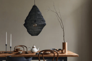
Fine dining establishments often serve multi-course meals. When it comes to painting, colours that will encourage customers to stay longer are ideal. Earthy tones like browns and deep reds are more inviting and foster a sense of comfort.
Setting the mood
Your restaurant’s colour scheme can also impact your customer’s appetite; use this to your advantage. Certain colours may encourage guests to eat more, which is why, how you paint your establishment shouldn’t be overlooked.
First, let’s discuss what paint colours you should avoid. Shades of purple and blue tend to reduce one’s appetite because our brains don’t associate such colours with food. However, if you’re running a coffee house or juice bar, you’ll benefit from the colour, blue, making people thirsty.
In a restaurant, warm paint colours are the best choice. Try pairing various shades of yellow and orange with white, green or wood colours. These colours make the room feel happier and allow customers to enjoy their food without any worries.
Stay on brand
Remember to stay on brand with your commercial painting. Your restaurant should represent the food you sell and the atmosphere you’re trying to create.
Whether you’re creating a tropical getaway or a cultural meal, your restaurant should showcase it. Bright colours are a great way to showcase a vacation-themed restaurant. Colours have varying meanings around the world, which should be kept in mind.
Pick your paint colours with a purpose. Choosing something because you like it won’t work if you aren’t catering to your clientele. A good paint job is another way to make your restaurant memorable.